For my Branding Identity and Design class, my teacher connected with the nearby town, Billerica, to see if they wanted redesigning for their town branding. They needed an economic branch logo for their town so we had a few meetings to understand them and their core values so we could design as fitting a logo as possible. We first designed some infographics with basic information about the town and its features.

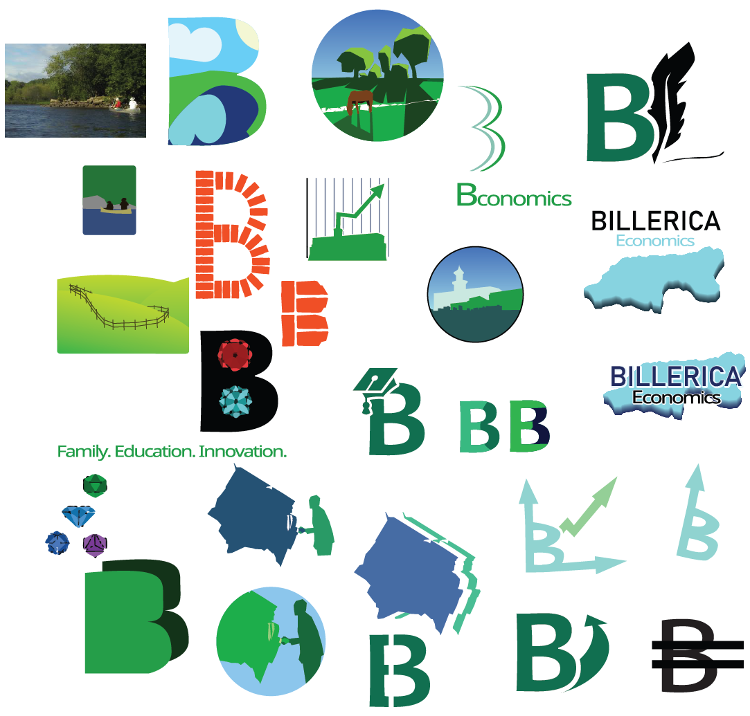
After another meeting, we had all the information we needed, and I brainstormed about twenty logos and found a few that I liked and wanted to move on with.

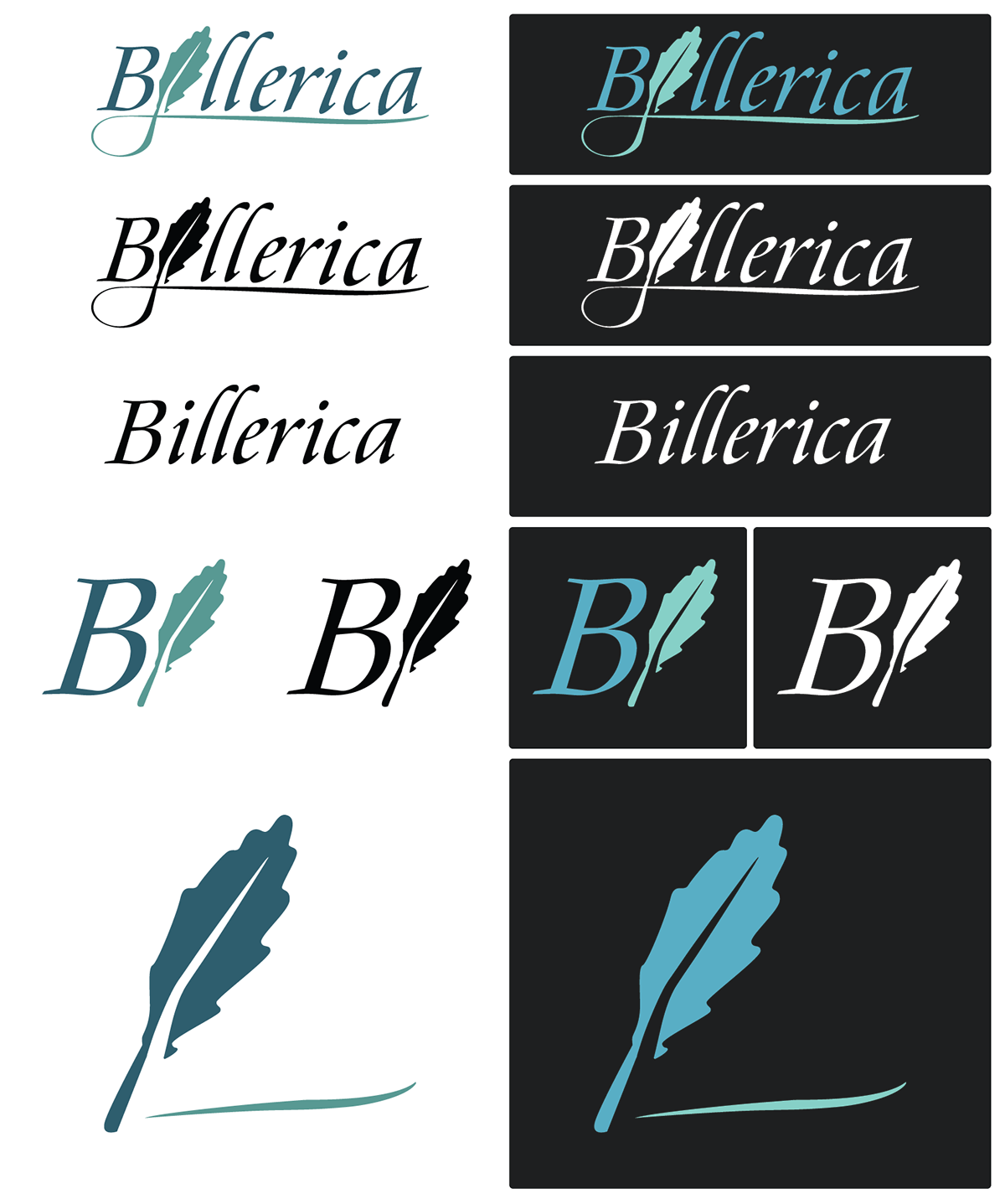
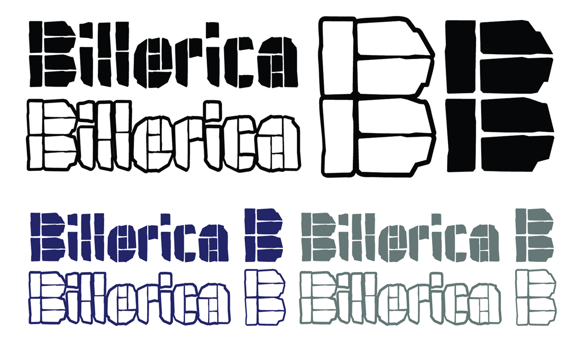
I polished one of my designs and we presented our first round of logo designs. These designs included a lettermark, logotype, image symbol, and combined mark. They gave us some feedback and I went back and redesigned it based on their criticisms. They wanted their logo to feel more urban and did not want to embrace the nature in their town.

We were then tasked to make trifold brochures for their town with some info in them. I continued the identity I created in my second final design.

